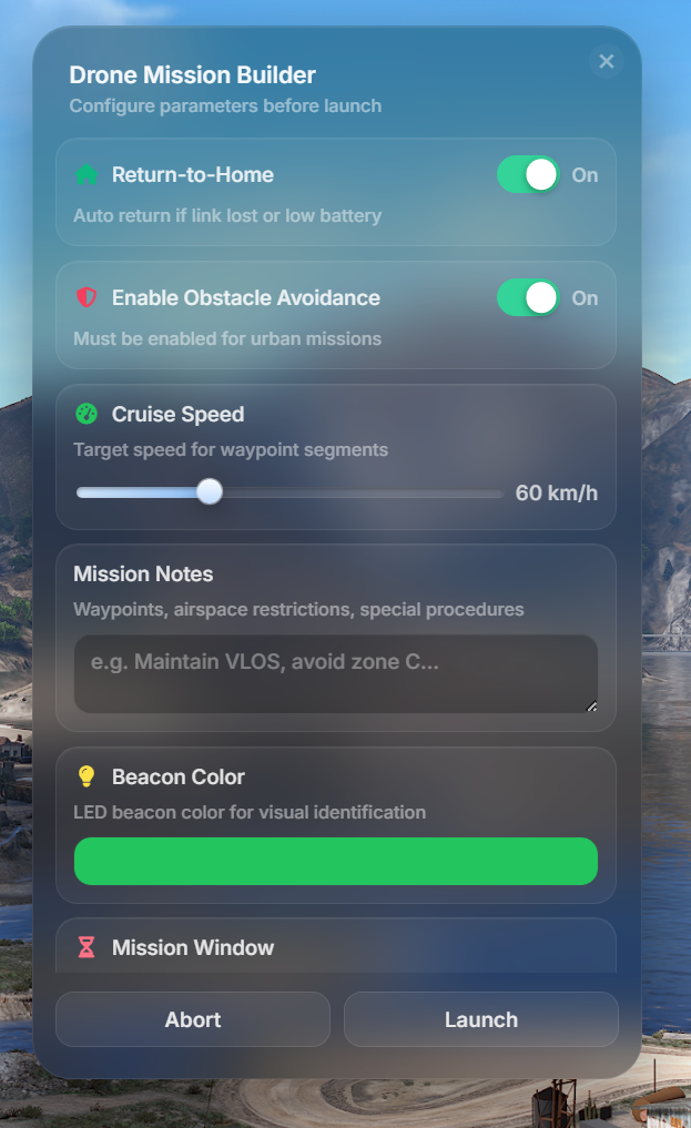
Input Dialog
`inputDialog(heading, rows, options)` → `table|nil`
Blocking. Shows an input dialog and returns a table of values in the same order as rows, or nil if cancelled.
| Parameter | Type | Description |
|---|---|---|
heading |
string |
Dialog title |
rows |
table |
Array of input field definitions (see below) |
options |
table |
Optional: allowCancel (boolean), submitText (string), cancelText (string) |
Row field types: 'input', 'textarea', 'number', 'checkbox', 'toggle', 'select', 'multi-select', 'slider', 'color', 'date', 'date-range', 'time'
Common row fields:
| Field | Type | Description |
|---|---|---|
type |
string |
Input type (defaults to 'input' if omitted) |
label |
string |
Field label |
description |
string |
Helper text shown below the field |
placeholder |
string |
Placeholder text |
default |
any |
Initial value |
required |
boolean |
Prevents submit if empty |
disabled |
boolean |
Renders the field as read-only |
icon |
string |
Font Awesome icon name or full class |
Additional fields by type:
number:min,max,stepslider:min(default0),max(default100),step(default1)select/multi-select:options— array of{ value, label }checkbox/toggle:checked— initial boolean state
local result = exports['amzn_uikit']:inputDialog('Create Character', {
    { type = 'input',  label = 'First Name', required = true },
    { type = 'input',  label = 'Last Name',  required = true },
    { type = 'number', label = 'Age', min = 18, max = 99 },
    { type = 'select', label = 'Gender', options = {
        { value = 'm', label = 'Male' },
        { value = 'f', label = 'Female' },
    }},
})

if result then
    local firstName = result[1]
    local lastName  = result[2]
    local age       = result[3]
    local gender    = result[4]
end
`closeInput()`
Closes the active input dialog programmatically (resolves as nil).
Previews
GLASS